Summary
The UK labour market statistics released at the end of last week reported continued improvement. However, long-term unemployment remains an important issue for many people, and it might take a while for that to get better.
What does the chart show?
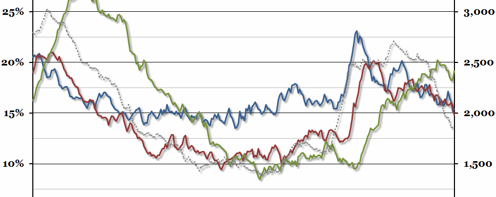
The official government figures break down the total number of unemployed people into four groups based on how long they have been unemployed for. This chart shows three of these groups as a percentage of the total number of unemployed people (aged 16 and over), over three month periods ending with the date shown. The blue line shows those who have been unemployed for between 6 and 12 months, the red line those who have been unemployed for between 12 and 24 months, and the green line those who have been unemployed for more than 24 months (all measured against the left hand axis). The largest group, those unemployed for less than 6 months, is not shown here. In addition, the dotted grey line shows the total number of unemployed people, in thousands, measured against the right hand axis.
Why is the chart interesting?
Total unemployment has been falling sharply for 18 months now, but the proportion of people within that group who have been unemployed for over 2 years has gone up slightly over that period. This reflects two things: that people who have been unemployed longer generally find it harder to re-enter the labour market, and that as time passes, people who fail to find a job will end up in the 2 year category. Meanwhile, the proportion of people in the 6-12 month and 12-24 month categories has been falling steadily. Hopefully the implied increase in short-term unemployment (those under 6 months) represents a shift towards a more normal economic situation, where most unemployment occurs during a temporary adjustment period between jobs, rather than a new wave of potential future long-term unemployed.

