Summary
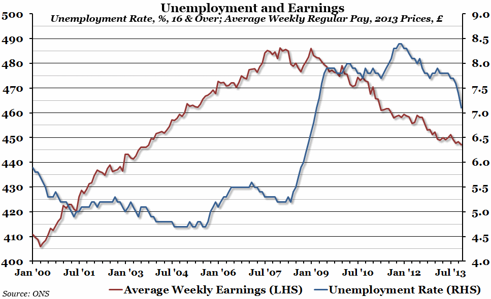
The monthly labour market statistics brought further good news this week as the unemployment rate fell to 7.1% in the three months leading up to November 2013. However, real average weekly earnings have also continued to fall.
What does the chart show?
The red line, measured against the left hand axis, shows average weekly regular pay (excluding bonuses) for the whole of the UK in pounds, adjusted for inflation (in November 2013 prices). The blue line, measured against the right hand axis, shows the unemployment rate (in percent) for everyone aged over 16 in the previous three months. Someone is defined as unemployed if they are without a job but are currently looking for one (so does not include those out of the labour market for any reason).
Why is the chart interesting?
The main focus of reports on the labour market statistics this week has been on the unemployment rate, and rightly so. Peaking at 8.4% at the end of 2011, unemployment looked stuck nearer to 8% than 7% for most of 2013. However, in the last few months of data, the unemployment rate has been dropping rapidly, and it may very well turn out that unemployment dropped to 7% or below by December of last year. On the other side of the coin, though, is the fact that real average weekly earnings have been dropping since the beginning of 2009, and have continued to do so even while unemployment is falling. Average weekly regular pay is now at £447, compared to an equivalent of £486 in 2013 prices at the peak – a decrease of £39 per week (or more than £2,000 if extrapolated over the course of a year). The story of the UK labour market at the moment is that more people are in work, but for less pay in real terms.

