Summary
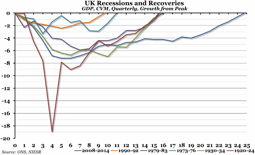
The preliminary estimate of GDP growth for the second quarter of 2014, released at the end of last week, suggested that the UK economy has finally overtaken the previous peak of output before the recession in 2008. This has set a new record for longest recovery post-recession.
What does the chart show?
This is an update to a chart we produced earlier in the year. It shows the quarterly change in Gross Domestic Product (GDP) over the six biggest recessions and recoveries in the last 100 years, compared to the pre-recession peak. Note that the ONS records only go back to the 1940s, so for the 1920s and 1930s we have used estimates of the GDP originally produced by the NIESR.
Why is the chart interesting?
The 2008 to 2014 recession and recovery was not the deepest the UK has experienced (although only the 1920-24 recession was worse), but it has been the longest by quite a large margin. The recovery times for the previous three worst recessions have been similar, taking just under four years for output to reach the pre-recession peak. This time, however, it has taken over six years to recover from the 2008 economic crisis, setting a new benchmark by which future recessions will be measured.
It is worth mentioning that by another measure, GDP per capita, the UK economy is still roughly 4% below the 2008 peak, because the population has grown over that period. This obviously means that although total output now exceeds the 2008 level, each person receives less of the proceeds from that output per average than they did before the recession.

