Summary
The CPI measure of inflation hit the Bank of England’s 2% target this week for the first time since November 2009. Officials at the Bank will be pleased, but in truth they had little to do with it.
What does the chart show?
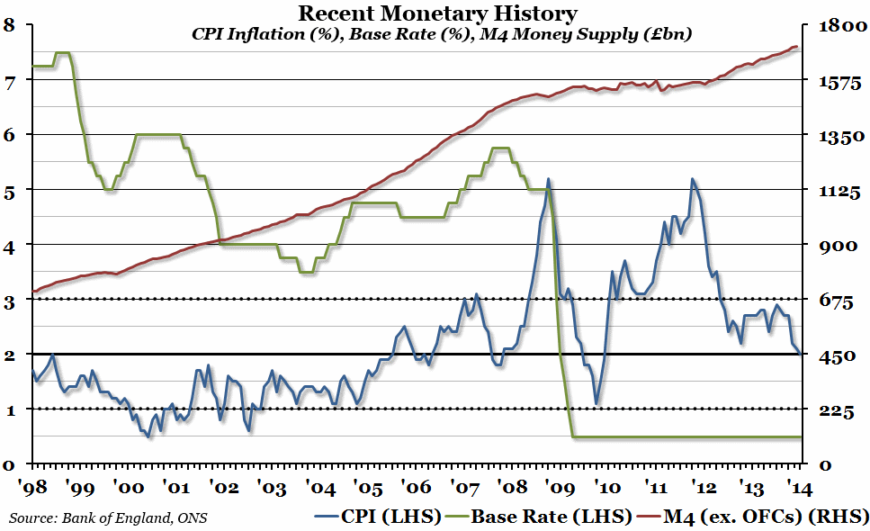
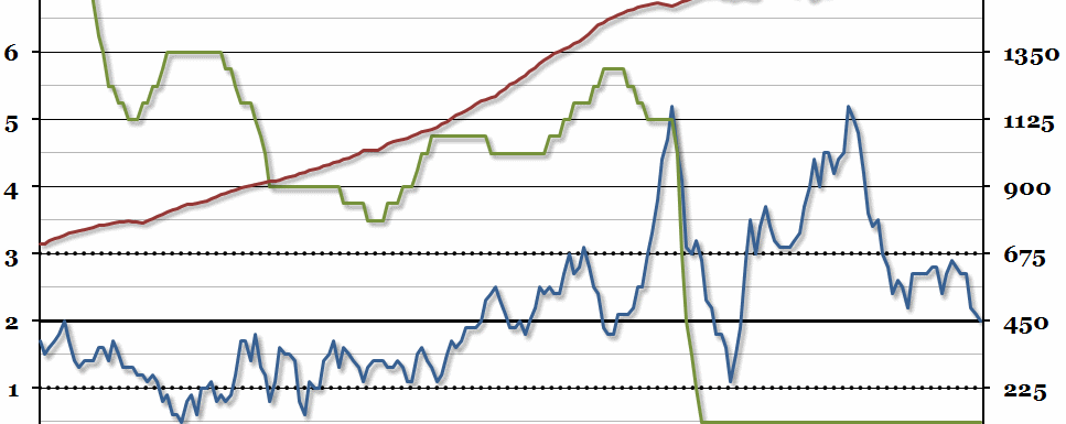
The chart shows three things. The red line represents the total money supply (using the M4, or broadest, definition, but excluding intermediate “Other Financial Corporations” (or OFCs)) in billions of pounds, measured against the right hand axis. The blue line shows the annual percentage change in the CPI measure of inflation that the MPC is currently charged with keeping within a percentage point of 2% (marked by the solid and dotted black lines), measured against the left hand axis. Finally, the green line shows the interest rate that the Bank sets (the Repo Rate until 2006, the Bank Rate from 2006 onwards) to try to achieve its goal (also measured against the left hand axis).
Why is the chart interesting?
We first produced this chart last summer, as a summary of the policy options available to the incoming Governor of the Bank, Mark Carney. Since then, inflation has fallen from nearer 3% to the target of 2%. However, there has been no change of policy at the Bank since Mr Carney took over that has led to the target being reached. The Bank’s official interest rate remains at 0.5% for the foreseeable future (and there is even less reason to increase it back to normal levels now), while the money supply has continued to grow (which you would usually expect to lead to higher levels of inflation, not lower ones). So while everyone should be pleased that inflation has falled to this important (but largely symbolic) landmark again, the new challenge is to keep it within the acceptable range more consistently than it has been in the recent past.

