Summary
This time last year, the Economic Research Council invited four property experts to share their forecasts for house prices in the coming year. We also invited members of the public to do the same. This week’s chart shows how they did. To see more information, please click here.
What does the chart show?
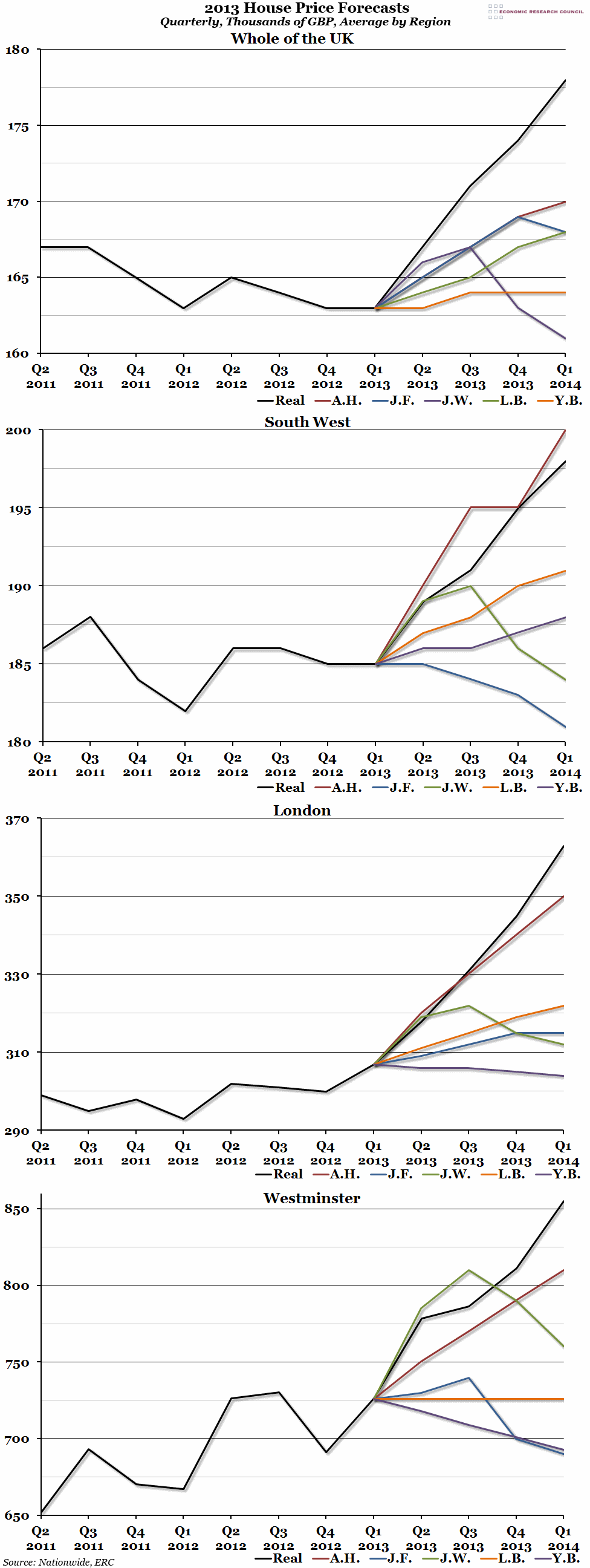
The four graphs included above show the out-turn and forecasts of our four experts. They were asked to predict the average house price, as reported by Nationwide, in each region (the whole of the UK, the South West, London, and the London Borough of Westminster) to the nearest thousand pounds. The black line in each graph shows the real figure. The coloured line shows each of the four expert predictions (blue for James Ferguson, purple for James Wyatt, green for Liam Bailey, and orange for Yolande Barnes), plus the closest member of the public (Ali Hijazi, the red line).
Why is the chart interesting?
Despite all being very different forecasts, none of them were all that close to reality. In fact, very few people predicted that London house prices would rise nearly as fast as they have, and even Mr Hijazi, the closest member of the public, was wrong by more than £10,000. As we reported in last week’s chart, differences between each region were extreme, as you can see by the vast differences in scale between the four regions above. One suggestion for why the forecasts were so far off reality was the unanticipated effect of government intervention in the market.
If you are interested in finding out more about the UK property market, including a discussion of why the forecasts were so wrong, tickets are still available for the ERC’s second annual property discussion on the 11th June (tonight). For more information and to book tickets, please click here.

