Summary
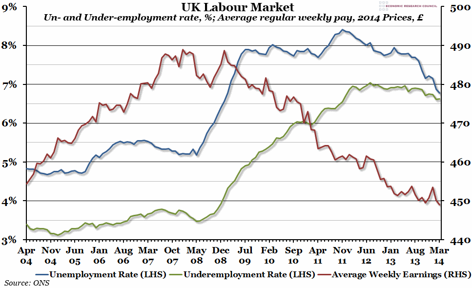
The official UK unemployment rate continued its sharp decline in the three months to March. However, real average weekly wages have shown no real signs of recovery, and the underemployment rate remains stubbornly high.
What does the chart show?
The red line, measured against the right hand axis, shows real average weekly regular pay (excluding bonuses) for the whole of the UK in pounds, adjusted for inflation (in March 2014 prices). The blue line, measured against the left hand axis, shows the unemployment rate (in percent) for everyone aged over 16 in the previous three months. Someone is defined as unemployed if they are without a job but are currently looking for one (so does not include those out of the labour market for any reason). The green line (also measured against the left hand axis) shows the underemployment rate – that is, the number of people in temporary or part-time work because they can’t find a full-time job, as a percentage of the total number of people in employment.
Why is the chart interesting?
The continuing decline in unemployment has dominated the headlines recently, and the fall since the middle of last year has been dramatic. The latest figures from the ONS suggest an unemployment rate in the three months to March of just 6.8% – the last time unemployment was that low was in February 2009. However, although the underemployment rate is falling slightly, it is not falling nearly as fast, and in fact, it may soon overtake the unemployment rate. Meanwhile, real average regular earnings have continued on their downwards trajectory, despite reports to the contrary (which usually include bonus payments or compare different time periods), and are now £5 per week less than they were 10 years ago.

