Summary
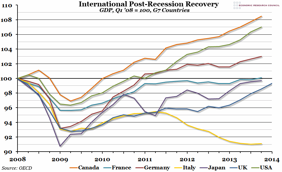
A preliminary estimate of Q1 GDP released by the Office for National Statistics yesterday suggested quarter on quarter growth of around 0.8%. While this is not quite enough yet to take the UK economy back above the pre-recession peak, it does mean we have now seen five consecutive quarters of decent growth. We decided to update our international recovery graph to see how the UK compares to the rest of the G7.
What does the chart show?
The chart shows an index of Gross Domestic Product (GDP) for each of the G7 economies. The index is calculated using chained volume estimates (designed to counter inflation) in the relevant local currency, and adjusted so that its value at the pre-recessionary peak (which differs across countries, but for our purposes counts as the first quarter of 2008) is equal to 100. This means that any value above 100 represents a higher real level of national output than before the recession hit, and vice versa.
Why is the chart interesting?
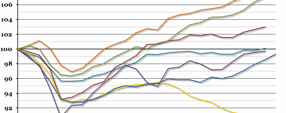
Since we last updated this graph, France has joined Canada, the United States and Germany in the group of economies that have grown beyond their pre-recession peak. Within that group, both Canada and the US have continued to grow strongly, while there has been an upturn in Germany. On the other side of the 100 line, the Japanese recovery has slowed down but, barring a catastrophic downturn, they still look set to reach the landmark output figure soon. Italy continues to languish at the bottom of the pile.
Meanwhile, the UK economy has been growing steadily for five consecutive quarters now, and it looks likely that we will reach the Q1 2008 level of output by the middle of this year.

