Summary
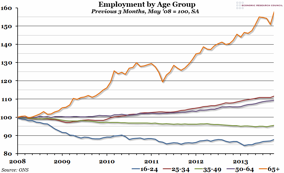
Data released today show that UK employment continued to increase, with the unemployment rate down to 6.9%. This week’s chart looks at how employment for each age group has changed since the financial crisis in 2008.
What does the chart show?
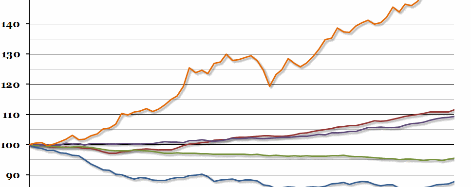
The chart shows an index of the total number of people employed in each age group over the previous 3 months, so that the period March to May 2008 (the pre-crisis peak of employment) is equal to 100 for each group. A number over 100 therefore represents more people in that age group in employment than at the peak, and a number under 100 represents fewer.
Why is the chart interesting?
Although there are more people in employment now than at the pre-crash peak, the benefits have not been shared equally between age groups. The problem of youth unemployment has been well documented, and 16-24 year olds are still well below the peak, although the number of young people in employment has been rising slowly for almost a year now. Less well documented is the other age group to have suffered: the 35-49 year old group, for whom employment has been falling steadily since 2008. In contrast, the 26-34 year olds and 50-64 year olds now both have roughly 10% more people in employment than in 2008. The 65+ age group has continued to flourish, although some of the increased volatility comes from the fact that the index is based on a smaller initial group of people.

