Summary
Tomorrow morning, the preliminary estimate for UK fourth quarter GDP growth will be announced, and we’ll get a first impression of annual growth for 2015. In preparation for that, this week’s chart shows the World Bank’s latest global GDP projections, taken from their recent Global Outlook report.
What does the chart show?
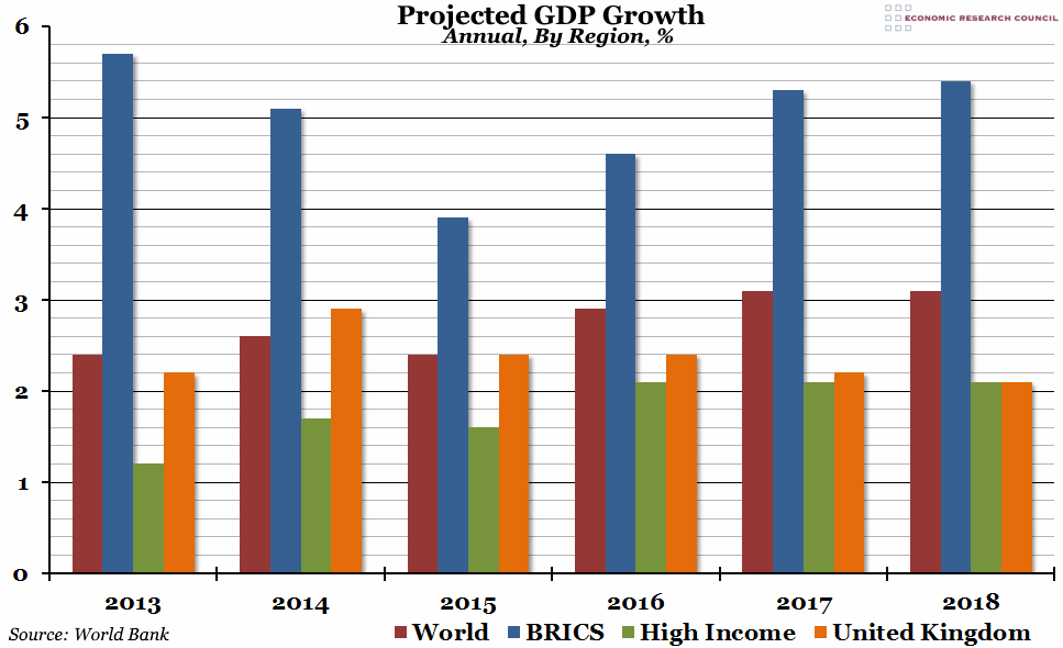
The chart shows annual percentage growth in Gross Domestic Product (GDP) at market prices, estimated for 2016 and forecast for 2016-18, for four different groups. In red is the world average, in blue is the BRICS group of countries, in green is the average for “High Income” countries, and in orange is the UK.
Why is the chart interesting?
In 2015, overall growth in the BRICS (Brazil, Russia, India, China, and South Africa) is estimated to fall significantly, to under 4%, as growth slows in four out of the five countries (all but India). This has had an important effect on global growth; the World Bank estimates that a 1 percentage point decline in the growth of the BRICS will have a 0.4 percentage point impact on global growth over the following two years. You can see from the chart that global growth in 2015 is estimated to be slower than in 2014, before recovering in 2016 onwards. This forecast is (perhaps optimistically) relying on a fast recovery in the BRICS’ growth rate back above 5% a year. With the carefully managed Chinese slowdown set to continue, and commodity prices still at very low levels, this may not happen as quickly as they have forecast.
The World Bank’s figures certainly make the UK’s growth rate look impressive: the UK was one of very few high income countries to out-perform the global average in 2014, and annual growth rates are not forecast to return to the high income average until 2018.

