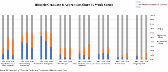
This chart shows the increasing graduate share and declining apprenticeship share in the workforce within selected work sectors since the late 1980s.
Chart of the Week: Week 47, 2013: The Graduate Labour Market
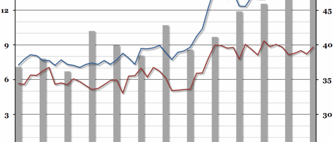
Summary Following on from our chart last week on underemployment, this week we looked at the interaction between recent graduates and young non-graduates in the labour market, courtesy of a recent ONS report. What does the chart show? The red and blue lines show the unemployment rate (the percentage of people within a group that […]


