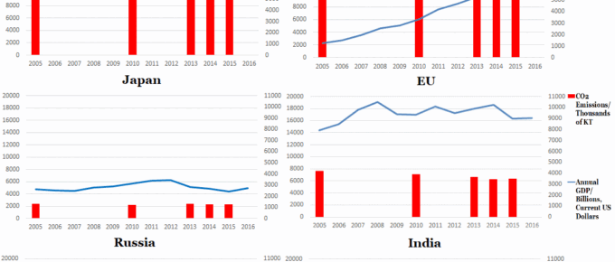
The set of graphs generally indicates that developed countries are beginning to reduce their emissions, whereas India and China are seeing their emissions rise, as they undertake vast infrastructure projects and continue to lift sizeable populations out of poverty.
Additional menu
Britain's Oldest Economic Think Tank

