I have outlined many confusing issues, the world economy in general is chugging along nicely in spite of everything. People and businesses are getting on with running their affairs and the steady, albeit slow, growth…
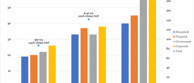
Chart of the Week: Week 28, 2017: Changes in Composition of Global Debt
This chart shows a positive trend in the growth of global debt, growing from $87 trillion in year 2000 to $199 trillion in 2014.
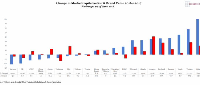
Chart of the Week: Week 27, 2017: Change in Market Capitalisation and Brand Value
This chart shows the performance of a number of brands detailing the changes in both their stock market capitalisation and brand value over the past year.
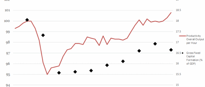
Chart of the Week: Week 26, 2017: Productivity Output v.s. Gross Fixed Capital Formation
This chart shows the relationship between the level of gross fixed capital formation (GFCF) and the productivity of the economy.
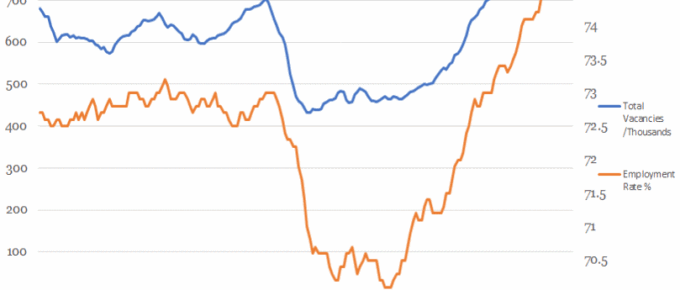
Chart of the Week: Week 25, 2017: Vacancies v.s. Employment Rate
This chart shows that the overall employment rate has been tracked by the number of available jobs until the financial crash.
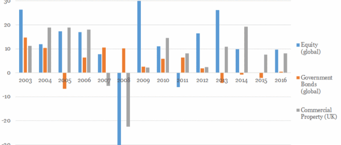
Chart of the Week: Week 24, 2017: Historical Asset Class Performance
This chart shows a snapshot of the performance of different asset classes: UK commercial property, global government bonds and global equity since 2003.


