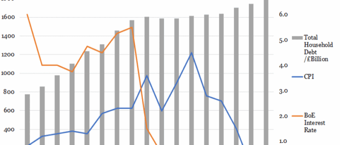
The base rate climbed steadily to 5.5% in 2008 before the global financial crash, after which it plummeted to 1.5% within one year as the Bank attempted to stimulate investment and consumption.
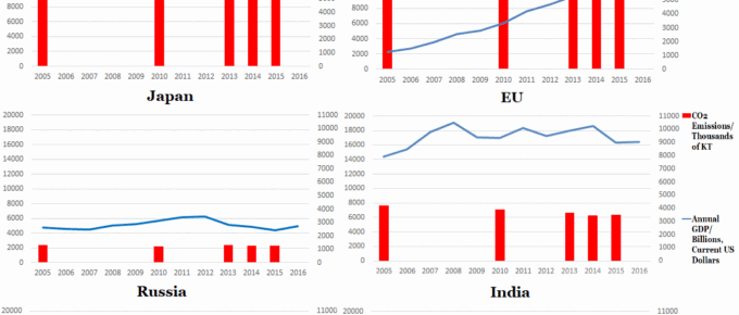
Chart of the Week: Week 29, 2017: Top 6 Polluters’ Emissions v.s. GDP
The set of graphs generally indicates that developed countries are beginning to reduce their emissions, whereas India and China are seeing their emissions rise, as they undertake vast infrastructure projects and continue to lift sizeable populations out of poverty.

August 2017
I have outlined many confusing issues, the world economy in general is chugging along nicely in spite of everything. People and businesses are getting on with running their affairs and the steady, albeit slow, growth…
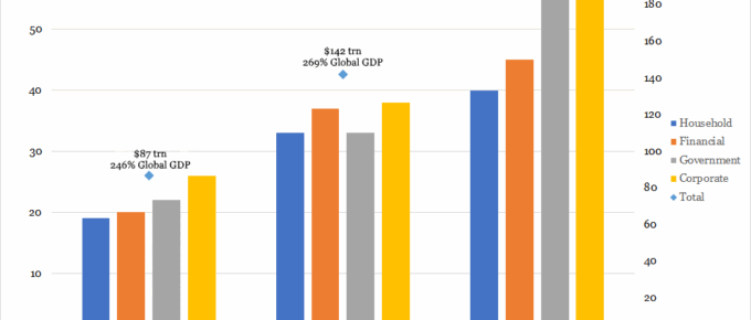
Chart of the Week: Week 28, 2017: Changes in Composition of Global Debt
This chart shows a positive trend in the growth of global debt, growing from $87 trillion in year 2000 to $199 trillion in 2014.
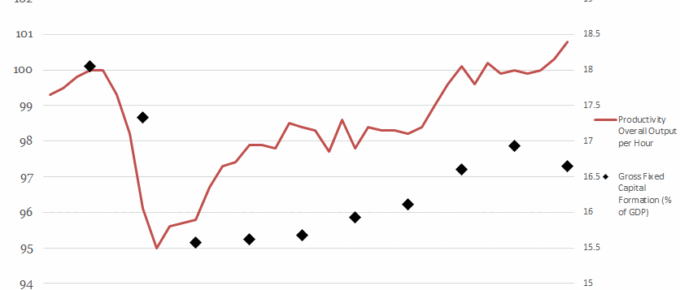
Chart of the Week: Week 26, 2017: Productivity Output v.s. Gross Fixed Capital Formation
This chart shows the relationship between the level of gross fixed capital formation (GFCF) and the productivity of the economy.
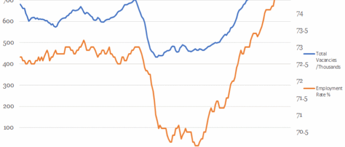
Chart of the Week: Week 25, 2017: Vacancies v.s. Employment Rate
This chart shows that the overall employment rate has been tracked by the number of available jobs until the financial crash.