Summary
The question of whether the Bank of England should raise interest rates to address current inflationary pressure has been widely debated over recent weeks. This week’s chart takes a historical look at the link between Bank Rate changes and the rate of inflation. Whilst interest rates have consistently been used as a tool to manage the demand-side of the economy, we question the extent to which the Bank of England sees it as useful in tackling cost-push inflation. The answer to this conundrum is particularly useful in understanding the likely direction of future monetary policy in the UK.
What does the chart show?
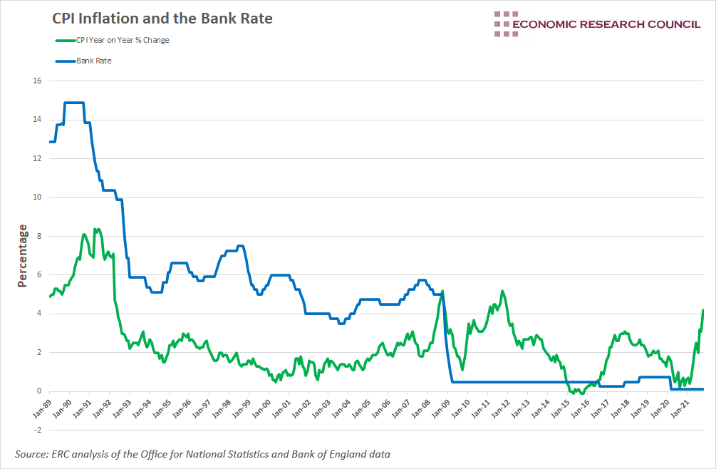
The chart displays the rate of CPI inflation as well as changes to the Bank Rate since 1989. Whilst the Bank Rate seems to follow conventional wisdom up until 2008, the positive correlation between it and the rate of inflation disappears after the financial crisis.
Why is the chart interesting?
Two weeks ago, the Monetary Policy Committee of the Bank of England decided to keep the Bank Rate at 0.1%, unchanged since March 2020. CPI inflation, standing at 4.2% is a whole 2.7% higher than the rate observed when interest rates were last reduced. As such, many have anticipated, and clamoured, for rate rises. Commentary from Trustnet has even described a rise as ‘inevitable’. In this week’s chart, we compare Bank Rate changes to historical levels of inflation, in order to better understand what drives changes in interest rates.
Since the UK left the Exchange Rate Mechanism in 1992, monetary policy has been based on a specific numerical target for inflation, currently at 2%. The chart displays the ‘great moderation’ period, spanning 1992 to 2007, where inflation and economic growth remained stable, and CPI stayed relatively close to its target. During the start of this period (between 1993 and the start of 1997) changes in the Bank Rate largely aligned with changes in CPI.
1997 presents a slight divergence between rate decisions and conventional wisdom, considering the trajectory of inflation. We can see that during this period, while CPI had been falling, the Bank Rate rose by over 1.25%. Nevertheless, with inflation close to its target, priority was placed on addressing growing domestic demand.
The year 2000 brought Bank Rate decisions back to conventional procedure. The CPI bottomed out at 0.5% in May 2000, leading the Bank of England to lower rates throughout the following year. From this point up until 2008, the chart shows a strong correlation between CPI and the Bank Rate, as higher rates are used to address growing inflationary pressure.
Whilst the above is somewhat insightful, it solely serves the purpose of highlighting the difference between inflation targeting practice pre and post 2008. After a sharp initial fall in the rate of inflation and the Bank Rate, the arrival of 2008 seemed to completely sever the positive correlation between the rate of inflation and the Bank Rate. Identifying the factors that encouraged previous Chancellors, and then the Monetary Policy Committee, to move the Bank Rate in the same direction as inflation prior to 2008, but seemingly ignore CPI afterwards, is incredibly useful in understanding Bank Rate decisions today.
From 2008, inflation rose sharply from around 2% at the start of the year to over 5% in September. This was largely driven by rising energy prices, with the price of electricity and gas increasing by 30% and 50% respectively on the year before. All of this occurred in the context of a worsening financial crisis. From November 2007 to September 2008, rates were reduced by 0.75%, indicating two things: 1) The Bank of England were more concerned about wider economic conditions and supporting the demand side of the economy than inflationary pressure, and 2) inflationary pressure was deemed to be temporary and would ease once the supply shocks had abated. This transitory understanding of inflationary pressure persisted in the aftermath of the financial crisis, and the Bank of England did seem correct in their interpretation of it. Through the 7 years and 2 months that rates were held at 0.5%, the average year on year rate of inflation stood at 2.24%, well within the Bank of England’s range of tolerance.
September 2021 was the first time since the start of 2012 that the rate of inflation stood above 3% for two consecutive months, with the rate currently at 4.2%. Understandably, this has led to expectations of an imminent rate rise. The economic recovery in the aftermath of the pandemic unleashed pent up demand that has contributed somewhat to the inflationary pressure we are currently experiencing. Despite this, it seems as though the Bank of England is being guided by the experience of the last 13 years. Inflationary pressure in 2008 and 2011 was largely due to rising energy prices. In this context, rates remained at historically low levels. Current inflationary pressure has similar causes, owing to rising energy prices and supply constraints. As such, it seems as though the Bank of England is sticking to its wait and see approach that has served it well in recent years.
The most fundamental takeaway from this week’s chart is an understanding of how the Bank of England targets inflation. It has been quick to act when inflationary pressure was clearly due to demand-side factors. Even when demand-side factors suggested increasing inflationary pressure, but had not resulted in it, the Bank of England has engaged in contractionary monetary policy to head it off. On the other hand, they have been reluctant to utilise monetary policy to address cost-push inflation, signalling that supply-side measures may be a more appropriate course of action.
By David Dike


