Summary
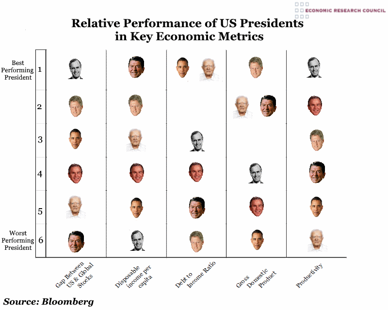
In this inauguration week, the ERC is looking back at the last six US presidents and the state of US economics during their terms. The chart shows that when considering only the above categories, Clinton presided over the period that was most successful economically, and Obama, the worst. Bush Senior comes second to Clinton overall, with Carter in third position followed by Reagan. George W Bush comes second to last in the ranking, despite ruling in a period of significant debt-fuelled growth in the run up to 2008’s recession. The US stock market performed best relative to others globally under Bush Snr, followed by Clinton. Interestingly, US stock markets relative to others perform better under Obama than under Bush Jnr, despite the 2008 recession.
What does the chart show?
The presidents’ pictures denote where they stand relative to each other based on the performance of the US economy in different metrics. The rankings are based on annual percentage change for all metrics except the debt to income ratio, which was ranked on annual percentage-point change.
Why is the chart interesting?
The chart shows that there is little correlation between the party affiliation of the president and economic performance. Although Reagan is credited with ushering in the free market reforms instrumental in the flourishing of the US stock markets, of the six presidents here, his presidency saw US stocks perform the worst compared to others globally. Obama and Carter (who some associate with a more ‘socialist’ approach) presided over periods with the best debt to income ratios compared with presidents who more vigorously championed the free market. The contraction in GDP growth following the 2008 recession can be seen in Obama’s low position relative to other presidents in this category, as well as poor levels of productivity and the second to lowest level of disposable income per capita.

