Summary
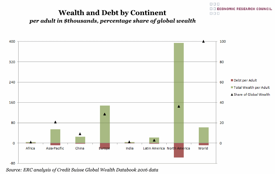
The chart demonstrates the vast disparities in wealth per adult across the world. North America and Europe hold 65% of the world’s wealth, whilst only accounting for 18% of the world’s adult population. In contrast, Africa and India have the lowest shares of global wealth (1% and 1.2% respectively).
What does the chart show?
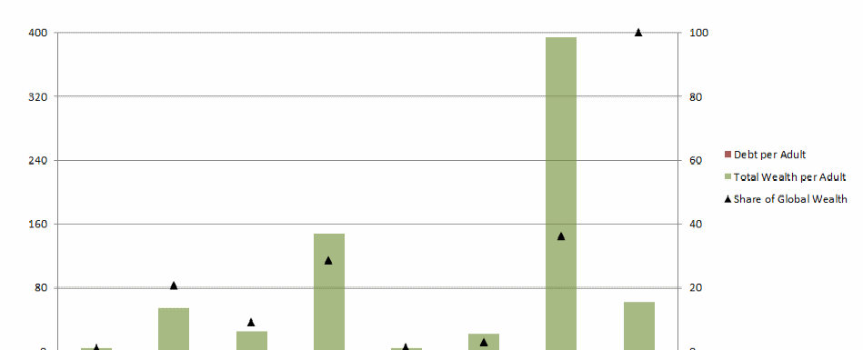
The black triangles represent the share of global wealth for each region. The green bars signify the total wealth (including financial and non-financial assets) per adult, whilst the red bars denote the average debt per adult. The wealth and debt is in thousands of US dollars and the data is from mid-2016.
Why is the chart interesting?
The chart shows the extent of the disparity in wealth across regions. Europe and North America account for the vast majority of household wealth (65%), but contain 18% of the population. Conversely, India contains roughly 17% of the world’s adult population, but holds just over 1% of its wealth.
The chart presents an interesting relationship between debt and the share of wealth across countries. For every 1% share in global wealth, the average adult in the Asia Pacific region accrued $390 worth of debt. This is in contrast to European and North American adults, who accrued $760 and $1566 for every 1% share of global wealth.

