Summary
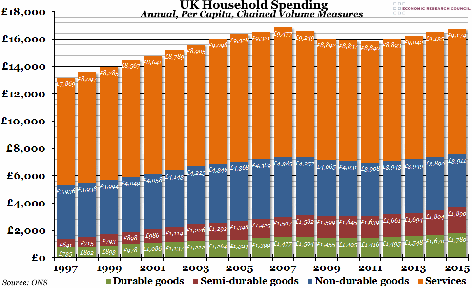
A large quantity of statistics relating to the final quarter of last year were released at the end of last week, and one interesting aspect was that real per capita household spending in 2015 almost returned to the 2007 peak.
What does the chart show?
The chart shows annual household expenditure (that is, spending by private individuals rather than by companies or the government) per person in real terms (adjusted for inflation, using the chained volume measure). This is broken down each year into four main spending groups: durable goods (large items such as furniture or vehicles, for example), semi-durable goods (clothing, games, books, etc.), non-durable goods (mostly food and drink, but also electricity, gas, and a few other items), and services.
Why is the chart interesting?
In the decade before the financial crisis, per capita spending increased in real terms every year as the effects of GDP growth were felt by consumers (and, to some extent, private debt was accumulated to allow extra spending). The biggest growth over that period came from semi-durable goods (particularly games and toys, but also clothing items as well), although all four main groups experienced steady gains. However, in the aftermath of the crisis, per capita real spending fell for four consecutive years before reaching a trough in 2011 (only semi-durable goods didn’t see a decline in spending over that period). Since then, household spending has begun to pick up again, and in 2015 it was less than £100 per person below the 2007 peak. While this is good news for the economy generally (higher private spending means more income for companies, which in turn usually leads to higher wages and further spending), there is some concern that recent spending has been driven once again by debt in the absence of significant increases in real disposable income.

