Summary
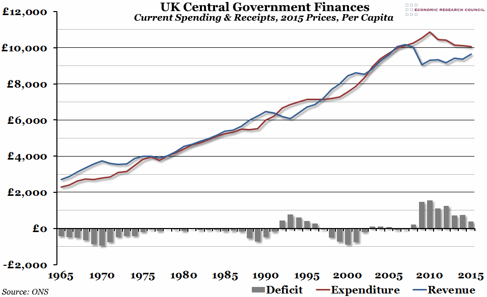
We’ve updated our annual chart on central government finances per person in time for this afternoon’s UK Budget speech. The current deficit fell in 2015 to just under £400 per person (the lowest it has been since the financial crisis).
What does the chart show?
The red line shows total real current expenditure payable by central government (i.e. not including local government or capital expenditure) per capita, in 2015 prices. The blue line shows central government receipts receivable (mostly taxes), also per capita in 2015 prices. The grey bars show the real deficit per person (expenditure minus revenues). A negative deficit represents a government surplus.
Why is the chart interesting?
In 2014, the current deficit widened slightly despite a cut in central government expenditure, as receipts fell unexpectedly. Last year, central government receipts rose to £9,647 per person, roughly equivalent to 2005 levels, and combined with expenditure falling to just over £10,000 per person, this meant that the deficit narrowed to roughly £390 per capita. Note that this excludes capital spending (investment in infrastructure, for example), and anything that falls outside the boundaries of “central government”.
In the aftermath of the financial crisis of 2008, the largest deficit in well over 50 years opened up as tax receipts fell substantially and government expenditure increased to ease the pain of the recession. Since then, current central government spending has fallen back to pre-crisis levels (in real terms), although receipts still remain slightly subdued. The remaining current deficit will be the Chancellor’s focus when he gives his Budget speech later this afternoon.

