Summary
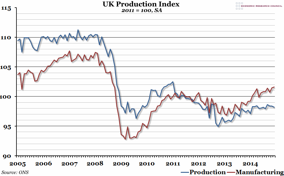
Yesterday, the Office for National Statistics released the index of the output for the production industries in December 2014. Compared to 2013, it was another strong year of growth in manufacturing, but the rest of the production sector levelled off slightly.
What does the chart show?
The chart shows a seasonally adjusted index measuring output of the production industries in the UK over the past ten years, with 2011 being equal to 100. The red line shows the manufacturing output, which is a subset of the overall production industries output shown by the blue line. The other elements that also make up the production index are mining and quarrying, and the utility industries such as electricity and water.
Why is the chart interesting?
Manufacturing, and to a lesser extent the production sector in general, was severely hit by the financial crisis in 2008, with output dropping by almost 15% from peak to trough. After an initial strong recovery, the production sector suffered a second downturn in 2011, dropping to a lower level of output than it had even in the depths of 2009. Manufacturing was less affected by this than the rest of the production industries, and has now experienced a couple of good years, finally overtaking the 2011 peak in 2014 (although it will take another 3 years of this growth to restore the level of output from the pre-2008 period). However, after a relatively strong 2013, the production sector as a whole stalled somewhat in 2014, and is still producing roughly the same level of output as it did in the 2009 trough.

