Summary
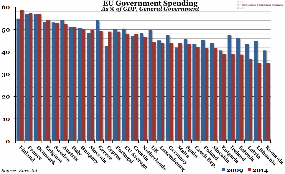
With the UK Budget due later today, this week’s chart compares total government spending, as a percentage of GDP, across all the EU countries. Since the general peak in 2009, spending has fallen in most European countries, and the UK government has cut its expenditure by more than the EU average.
What does the chart show?
The chart shows total general government expenditure (combining both central and local government), as a percentage of GDP, for all 28 EU countries, plus the EU average. The red bars are spending in 2014 (the latest available data), and the blue bars are spending in 2009 (the peak for most of the included countries).
Why is the chart interesting?
Although government expenditure as a proportion of GDP has, on average, fallen across the EU (from 50.3% to 48.1%), it has actually only been cut in nominal terms in five European countries: Ireland, Greece, Spain, Portugal, and Croatia (the only country where nominal spending has fallen, but spending as a percentage of GDP has increased). However, expenditure as a percentage of GDP is a useful measure of affordability, and the UK is an example of an economy that has significantly cut this measure of spending since in 2009. At the peak, UK spending was similar to the EU average, and places like Portugal and Italy. In the last five years expenditure has grown slower than GDP, and the UK is now more comparable to countries like Germany, Luxembourg, and (perhaps surprisingly) Spain.
An interesting sidenote in the Eurostat figures was the breakdown of spending (for which the latest data is 2013). Across Europe in general, the single biggest item of expenditure is on social protection for the elderly (making up an average of 21.4% of total spending). In comparison, unemployment spending (at a time when unemployment has been shockingly high across Europe) made up 3.2% of the total. This is mirrored in the UK, where spending on old age was 18.9% and unemployment was just 0.6%.

