Summary
A few weeks ago, we produced a chart which showed how the UK service sector is outperforming other sectors and dragging GDP growth up. However, within the broad category of “Services”, there are a wide range of sub-sectors that have performed very differently since the recession.
What does the chart show?
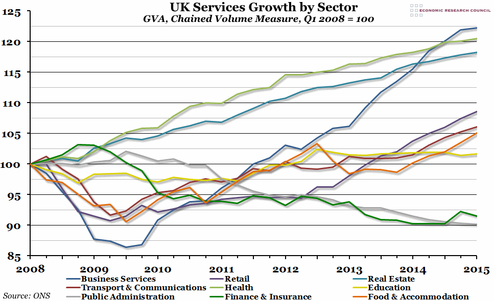
The chart shows how output (by the Gross Value Added, or GVA, measure) of the nine main sub-sectors making up the services sector has changed since the peak of GDP at the beginning of 2008, indexed so that a value of 100 represents the output at that peak.
Why is the chart interesting?
Most of the responses we received to the previous chart showing services outperforming all other sectors were asking whether that was the effect of financial services supporting the rest of the economy. One of the most obvious things that you can see in the above chart is that financial (and insurance) services have actually been one of the worst performing sub-sectors (along with public administration), shrinking by more than manufacturing since the recession. Productivity growth in the financial sector has been particularly low recently, which is undoubtedly part of the problem, but this probably also represents a slow return to a sustainable level after the bubble burst in 2008.
Luckily for the UK GDP statistics, two of the strongest performing sub-sectors (general business services and real estate) are also two of the largest, and they (along with the healthcare sector) have been dragging overall service sector growth up.

