Summary
At the end of last week, the Office for National Statistics released the output of the production industries for December 2013. The rise in output of 0.5% between Q3 and Q4 was below the forecast of 0.7% which informed of the preliminary GDP estimate (also of 0.7%).
What does the chart show?
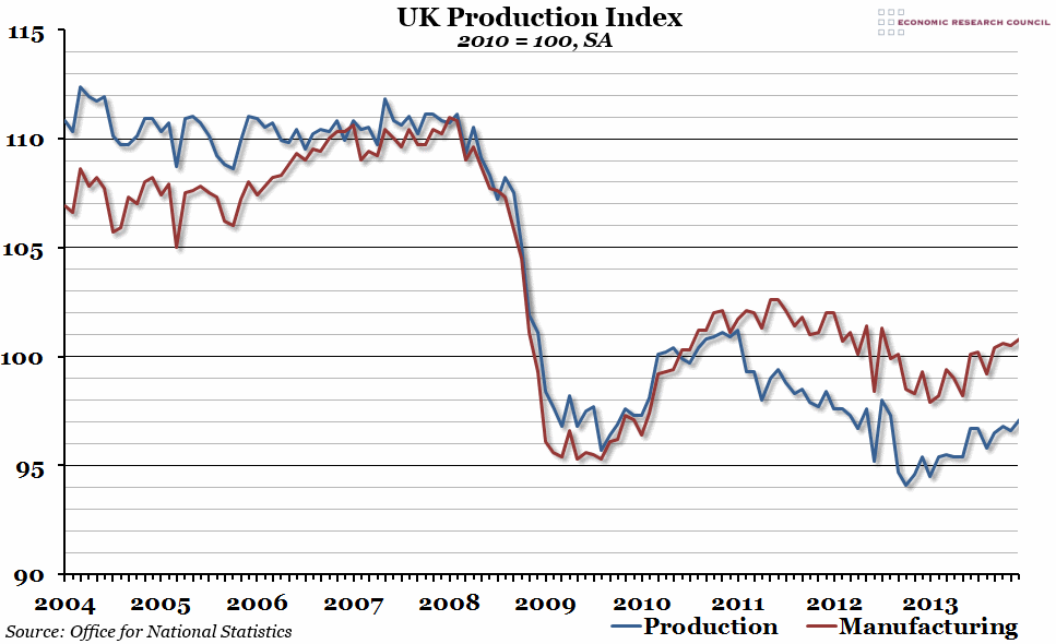
The chart shows a seasonally adjusted index measuring output of the production industries in the UK over the past ten years, with 2010 being equal to 100. The red line shows the manufacturing output, which is a subset of the overall production industries output shown by the blue line. The other elements that also make up the production index are mining and quarrying, and the utility industries such as electricity and water.
Why is the chart interesting?
The past decade has been a tale of two halves, with the period between 2009 and the present being characterised by much lower output than the previous five years. However, over the course of 2013 output in both manufacturing and production more generally has begun to recover from the general decline that began at the end of 2010. Although we haven’t yet reached even the post-2009 high, the trend seems to be moving in the right direction.
However, the increase from the third quarter to the fourth quarter of 2013 was slower than expected when the official estimate of GDP was released (0.5% compared to 0.7%). This may lead to the initial GDP forecast of 0.7% being downgraded at the end of the month, but probably not by much; the ONS estimates that the impact is likely to be less than 0.05%.

