Summary
This week two departments of the UN released a joint report which put forward a new way of measuring a nation’s wealth. The “Inclusive Wealth” measure tries to include a number of things that GDP misses out, and produces some interesting results.
What does the chart show?
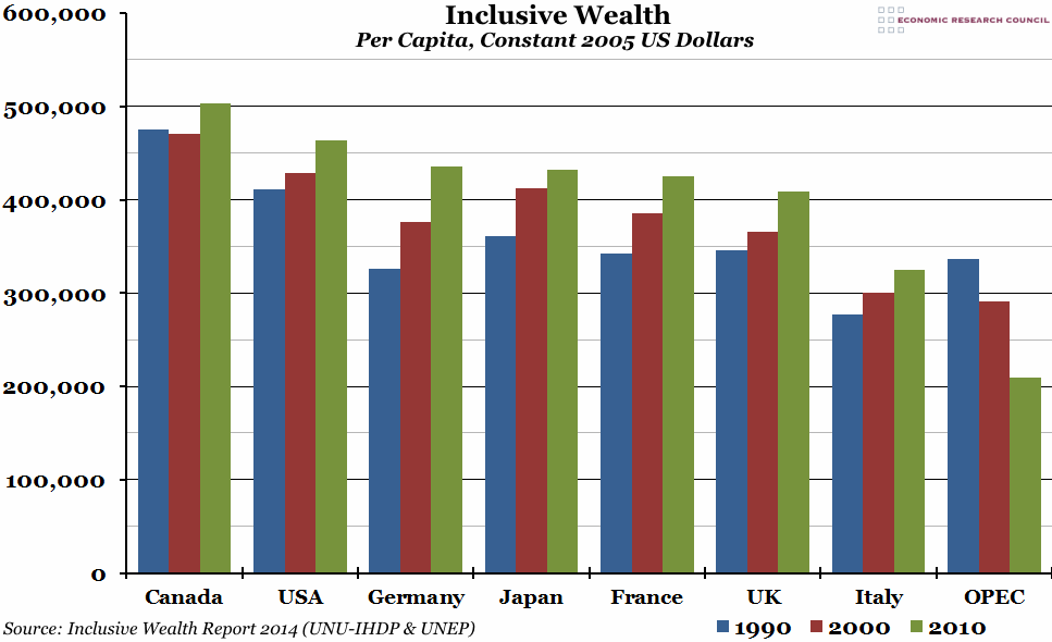
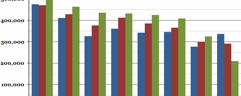
The chart shows the per capita wealth of each of the G7 countries, plus the OPEC average, according to the inclusive wealth measure. This is a combination of manufactured capital, human capital and natural capital. The blue bar is the value for each country in 1990, the red bar in 2000, and the green bar in 2010, all in 2005 US dollars (so inflation is accounted for).
Why is the chart interesting?
The Inclusive Wealth report attempts to address a number of problems with current economic measures of wealth by including manufactured capital (typically captured by GDP), human capital (similar to the Human Development Index) and natural capital. This means that as well as economic output, the health and education of the population and the stock of natural resources of a country is taken into account. As you can see, the UK’s inclusive wealth grew from 1990 to 2010, but not as fast as in France or Germany, which started the twenty year period behind the UK but finished ahead. Canada scores very highly, as it has abundant natural resources spread out over a population half the size of the UK’s. The OPEC countries (a group of twelve oil producing nations) have mostly done well in terms of GDP growth, but this report suggests that their inclusive wealth has fallen by a third over the period as they have been depleting their supplies of natural resources in an unsustainable way.
Generally speaking, this measure indicates that true growth has been slower than GDP figures suggest, and while it is still being developed, it represents the work of an increasing number of economists who are unhappy with traditional measures of well-being.

