Summary
This week, the Office for National Statistics published their annual international productivity comparison. The UK remains 6th out of the G7 in terms of output per hours worked, and since 2007 the UK has performed worse than the G7 average compared to previous trends, opening up a large productivity gap.
What does the chart show?
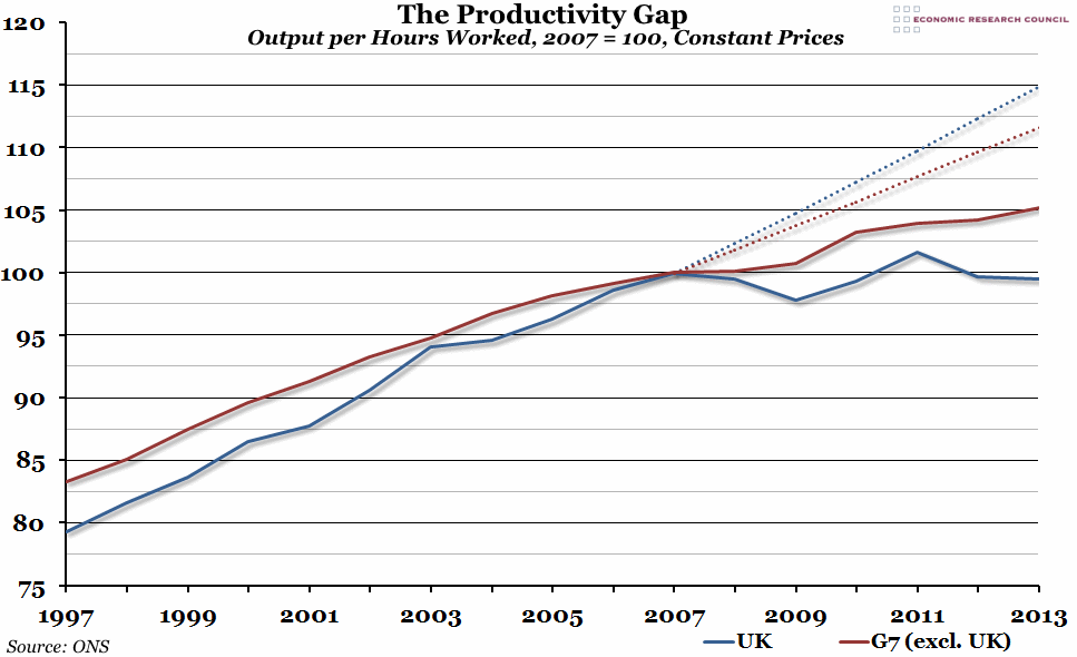
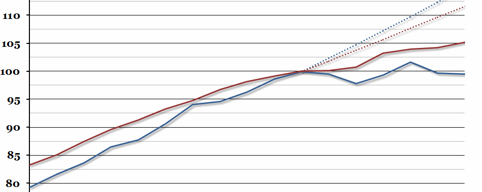
The solid lines in the chart show national output (measured by GDP) in constant prices (adjusted for inflation) per hour worked in the UK (the blue line) and the rest of the G7 (the red line). This has been indexed so that 2007, the most recent peak of productivity, is equal to 100 for both regions (note that this does not imply that productivity in the UK was equal to the G7 average in 2007 – it was actually about 6% lower; each region was indexed separately). The dotted lines represent a projection of the long-run trend which might have been expected had the recession not happened in 2008. The difference between the solid lines and the dotted lines is commonly referred to as the “productivity gap”.
Why is the chart interesting?
The UK continued to suffer from poor productivity in 2013, especially compared to other large economies. The gap between the UK’s productivity and the rest of the G7 average grew to the largest it has been since 1992. However, this chart, which featured in the latest ONS report, shows the extent of the problem in the UK. Before the 2008 crisis, productivity in the UK was growing faster than it had been in many of the other G7 countries. There had been a general slowdown since 2003, but the long term trend in the UK was better than elsewhere. However, after the recession, productivity in the UK has remained largely flat, while the G7 average has continued to grow (albeit slower than predicted). This has led to the UK experiencing a far larger productivity gap than the G7 average: 15.4% compared to only 6.4% for the G7 excluding the UK.
This poor productivity is one factor that helps to explain the unprecedented fall in real average wages, covered in last week’s chart, as the economic return on labour is smaller than it has been in the past.

