Summary
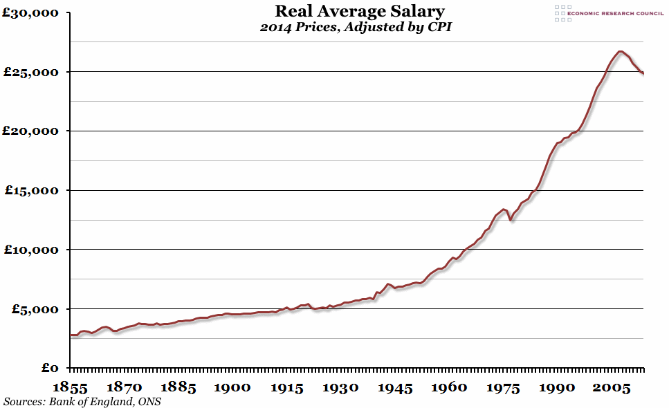
In a report released over the weekend, the TUC claimed that the current squeeze in real earnings is the most severe since our records began almost 160 years ago. This brought to our attention the excellent historical figures available at the Bank of England, which we have used in this week’s chart.
What does the chart show?
The chart shows the UK average annual earnings since 1855, adjusted by the Consumer Price Index to reflect 2014 prices. Up to 2009 this is based on the Average Earnings Index compiled by the Bank of England from a number of different sources. After 2009, we have used the Office for National Statistics’ data on Average Weekly Earnings. The figure for 2014 is an estimation based on the 8 months of data up to August that we have so far.
Why is the chart interesting?
More than anything else, this graph really highlights the massive growth in average earnings in the post-war period. Having grown by £5,000 in today’s money in the century between 1855 and 1955, they then shot up by almost £20,000 in the next fifty years. The second interesting point, and it is the one that the TUC were making in their report, is that in the past 159 years there have only been a few periods when real earnings have fallen for more than a single year at a time. Of those select periods (1865-67, 1874-78, 1921-23, 1976-77 and 2007 to now), the current one is by far the most serious we have experienced, and the earnings data released this morning shows that it looks set to continue.

