Summary
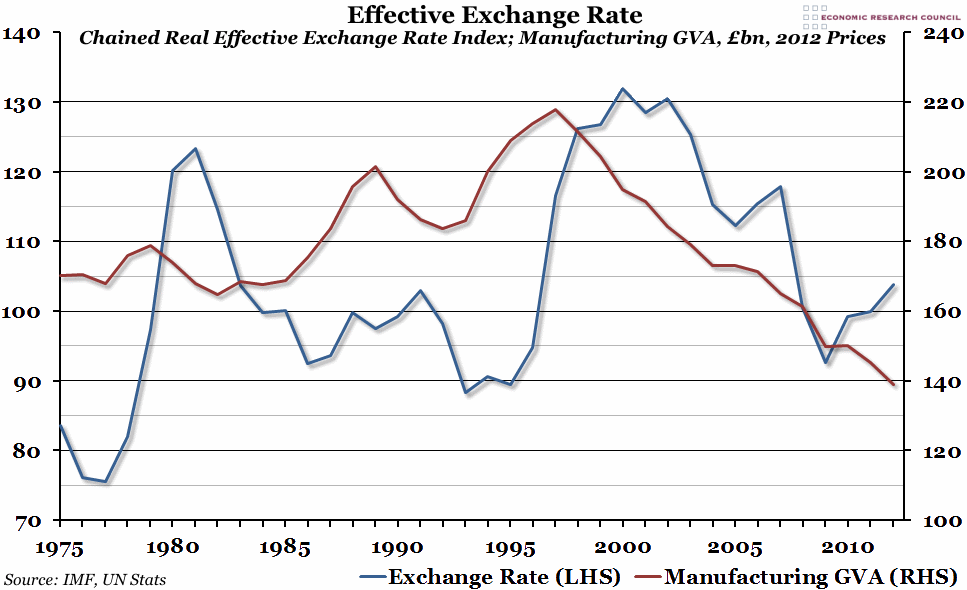
The decade leading up to the 2008 financial crisis was characterised by a very high real effective exchange rate, but also a period of serious decline for the UK manufacturing sector. This represents a longer term connection between the two.
What does the chart show?
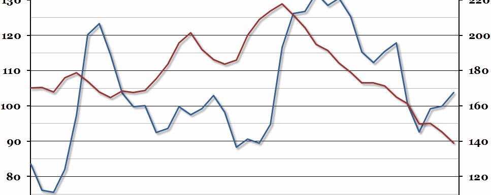
The blue line (measured against the left hand axis) is the real effective exchange rate index, as compiled by the IMF. It essentially shows the strength of the pound against a selection of other currencies, adjusted for inflation (in all countries concerned). The red line (measured against the right hand axis) is the Gross Value Added (GVA) to the UK economy by the manufacturing sector, measured in billions of pounds. It has also been adjusted for inflation: it is shown in 2012 prices.
Why is the chart interesting?
The apparent connection between manufacturing output and the strength of the pound is made very clear by this graph. Whenever the exchange rate index is below 100, manufacturing has grown, and vice versa. The one exception to this pattern was in the immediate aftermath of the 2008 recession, when the value of the pound and manufacturing output both fell sharply. The link between the two makes sense: manufacturing, more than any other sector of the economy, has to be able to compete internationally (both against foreign imports and to make use of foreign markets), and the exchange rate is an important part of that.
On Monday 6th October, the Economic Research Council will be hosting John Mills, who believes that the key to Britain’s economic future is a weaker pound, boosting UK manufacturing and exports in general, and David Smith, who thinks the costs of a weak pound outweigh the benefits. To find out more about their upcoming debate, or to book your place, please click here.

