Summary
While the total level of employment in the UK continues to break records, real average wages are still declining steadily.
What does the chart show?
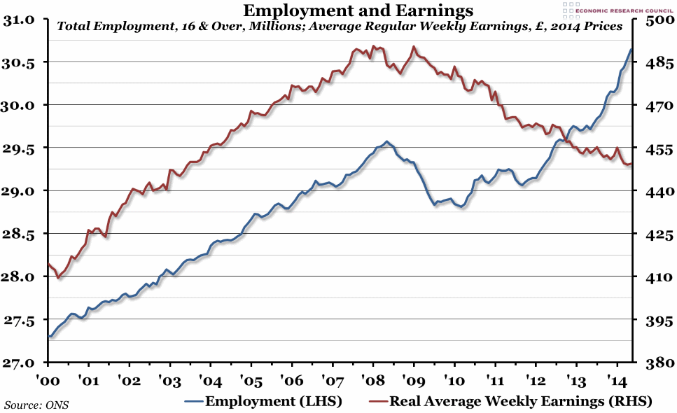
This week’s chart shows both employment and earnings. The blue line, measured against the left hand axis in millions of people, shows the total number of people aged 16 and over in employment over the preceding three months. The red line, measured against the right hand axis in pounds, shows the average weekly earnings (reported monthly) adjusted for inflation (so they are in today’s prices), excluding bonuses and arrears.
Why is the chart interesting?
Both political parties had cause to quote from today’s labour market statistics at Prime Minister’s Questions. The Conservatives rightly pointed out that employment levels were at new record levels. Not only that, but the number of people in employment grew faster in the last year than in any other 12 month period since at least 1992. The unemployment rate is down to 6.5%, closer to the pre-crisis levels of 2007/8, and while underemployment remains a problem, there is some suggestion that it may be declining as well.
However, Labour continue to draw attention to the fact that in real terms, average earnings are declining, and have been doing so now for over five years. Real pay has declined to the point where today, average weekly earnings are equivalent to the level of pay received in September 2003. This doesn’t take into account the inflation figures for June, when CPI rose to 1.9%, which is only going to make the situation worse. Both parties are right: there are both good and bad things about the UK labour market at the moment.

