Summary
Trade deficit statistics have been even more volatile than usual recently, but the UK’s trade balance looks like it has been improving slowly.
What does the chart show?
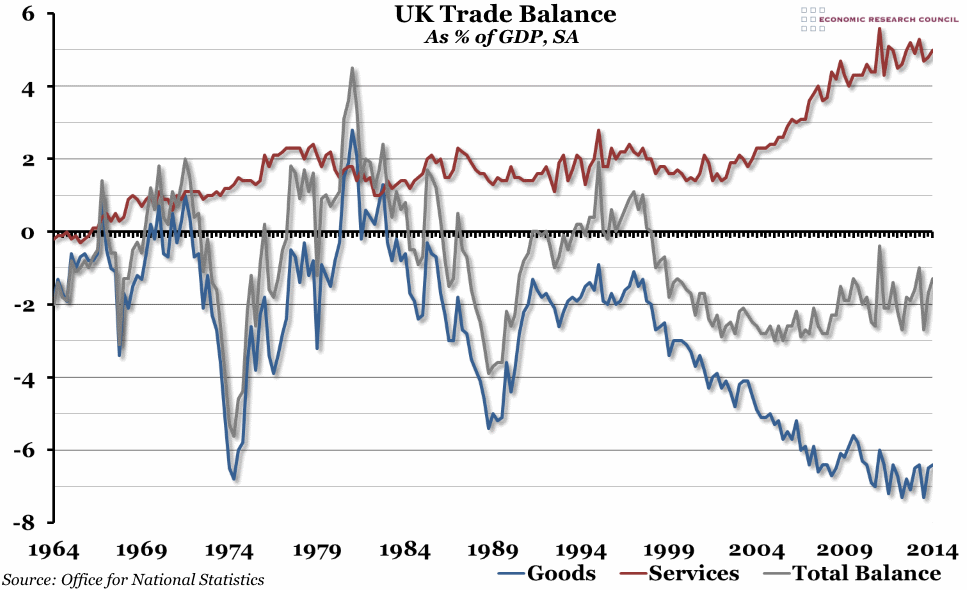
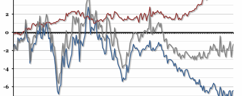
The balance of trade is the difference between total exports and total imports (or net exports). A positive number means exports have exceeded imports, and vice versa. The grey line shows the total quarterly trade balance as a percentage of GDP. The red and blue lines show the trade balance in services and goods respectively, also as a percentage of GDP.
Why is the chart interesting?
Since the most recent low point in the early-2000s (when increases in exports of services hadn’t yet made up for the declining balance in trade of goods), the overall balance of trade in the UK has been trending upwards (despite the general volatility that has crept in since the 2008 financial crisis and subsequent recessions). When we last looked at the trade balance, around a year and a half ago, it looked like things were getting worse again. However, revisions to the statistics over the past year combined with new data for 2013 and the first quarter of 2014 have changed that outlook. There have been a few poor quarters, but in general it looks as though net exports of services are still increasing (albeit slower than before), while the balance of trade in goods is levelling off somewhat. The last two quarters have shown an improvement in the overall trade balance position, fuelled by increases in net exports of both goods and services.

