Summary
This afternoon, the Chancellor will present the UK Budget for the coming year. In preparation for that, we’ve updated our annual graph showing real per capita government expenditure and revenue. It is looking better for George Osborne this year, with the deficit down significantly.
What does the chart show?
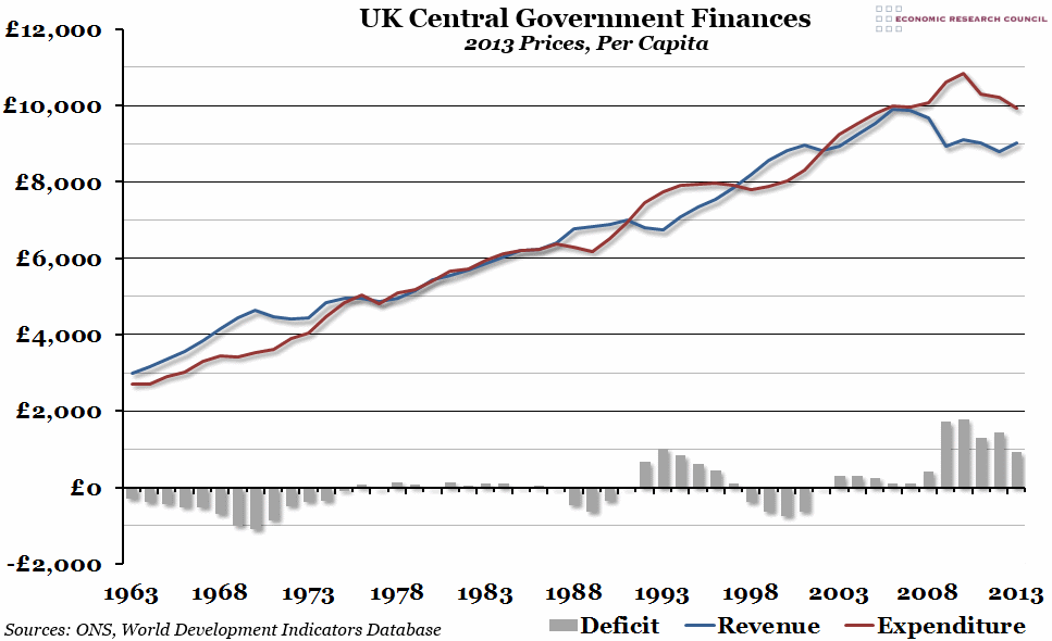
The red line shows total real expenditure payable by central government per capita, in 2013 prices. The blue line shows central government receipts receivable (mostly taxes), also per capita in 2013 prices. The grey bars show the real deficit per person (expenditure minus revenues). A negative deficit represents a government surplus.
Why is the chart interesting?
Figures for government finance can sometimes seem overwhelming, so breaking it down into per capita real numbers can be helpful. Deficits after the 2008 financial crisis shot up, caused both by rising expenditure and falling revenues (in contrast to the previous high deficits in the early 1990s, caused primarily by rising expenditure and largely static revenues between 1989 and 1994). Since the real peak in 2010, expenditure per capita has been falling, while revenues have stayed largely flat. In 2013, revenues rose for the first time since 2010, while expenditure fell, causing the per person deficit to fall to less than £1,000 for the first time since before the crash. In fact, the current deficit is smaller than the pre-2008 peak in 1993. The Chancellor is likely to be in a bullish mood this afternoon, although he will probably keep any big policy announcements until next year, before the election.

