Summary
The Office for National Statistics’ annual household spending report came out last week, so this week’s chart is on how household spending has changed over the past decade (just in time for Christmas).
What does the chart show?
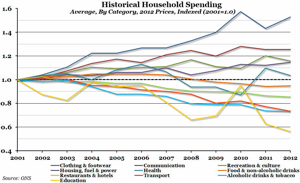
The chart shows an index of household spending since 2001, broken down into several categories. We’ve taken the basic ONS average weekly household expenditure in 2012 prices, and adjusted it so that the figure within each category for 2001 is equal to 1. Any number greater than 1 therefore represents an increase in spending over time, while a number less than 1 represents a decrease in spending.
Why is the chart interesting?
Over the past ten years, the UK’s spending profile has changed considerably. Of the ten categories, spending has increased in half and decreased in the other half. Spending on communication, recreation and culture, housing and fuel costs, and health has increased over the period. Meanwhile the amount of money the average household spends on food, drinks of all kinds, tobacco products, restaurants and hotels, and transport has decreased since 2001.
However, the two biggest changes are that household spending on education is now less than 60% of what it was in 2001, while spending on clothing and footwear is over 50% more than it was back then. Something to think about over the Christmas period!
The ERC Chart of the Week and Weekly Digest will be taking a break over the holidays, and will be back on the 8th January 2014.

