Summary
At the very end of last year, the US was heading towards a “fiscal cliff”, and although a deal was agreed, the Economic Research Council pointed out in our first Chart of the Week of 2013that the debt ceiling still loomed ahead. Fast forward nine months, and history is repeating itself, except this time, a budget deal has not been agreed, causing most government services to shut down (including, frustratingly for us, the Bureau of Economic Analysis website). While this drama is playing out, the debt ceiling is also fast approaching crisis point.
What does the chart show?
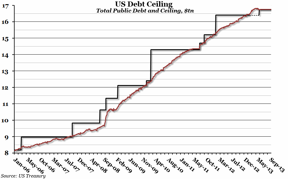
The red line shows the daily total US public debt (government debt held by the public and intragovernmental holdings) in trillions of dollars since January 2006. The black line shows the debt ceiling (the self-imposed limit on how much the government is allowed to borrow), also in trillions of dollars. The debt limit was temporarily suspended between February and May of this year, shown by the dotted black line.
Why is the chart interesting?
Back in January, we reported that the US had roughly two months to extend the debt limit in some way. In February, it was temporarily suspended, before being set to the current debt level in May. Since May, the total public debt has been right at the limit (for possibly the longest period of time in recent history). However, government finances are now at a point where the debt ceiling must again be extended before 17th October, or the US will be forced to default on some of its debt for the first time. This would be an economic disaster, probably on a global scale. At the beginning of the year, we didn’t doubt that the ceiling would be lifted. It will probably be lifted again. However, with all attention on the current budget stand-off, it is hard to feel so confident this time around.

