Summary
The services sector is crucial to the UK economy. In the first quarter of 2016, it was only growth in that sector which kept overall economic growth positive, with the production industries in recession. However, there is wide variation in the performance of specific industries within “services”, and that gap continues to widen.
What does the chart show?
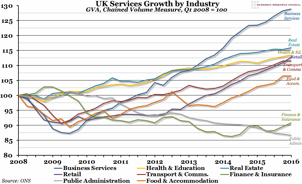
The chart shows how output (by the Gross Value Added, or GVA, measure) of the eight main sub-sectors making up the services sector has changed since the peak of GDP at the beginning of 2008, indexed so that a value of 100 represents the output at that peak. Their order in the legend represents their relative importance within the UK economy (business services is the largest sub-sector, while food and accommodation services is the smallest one shown).
Why is the chart interesting?
The most obvious thing to note is that although financial services have been growing for the past year, they remain almost 10% below their pre-crisis levels and are, contrary to popular wisdom, one of the smaller industries in terms of output. Of far more importance are “business services”, which include a wide variety of things from administration to consultancy and “professional scientific” work. These have continued to grow strongly (to almost 30% more than the pre-crisis peak) despite being hardest hit by the recession, and they are one of the main driving forces behind economic growth in the UK. Another strong performer has been retail, which has grown steadily since 2012.
Two other points of interest stand out. The first is that “public administration”, which is made up of all governmental services (excluding healthcare and education, which are important enough to get their own category), has been steadily declining since 2010 as a result of austerity and the drive to reduce the deficit. The second is that the effect of the London Olympics can be clearly seen in the spike in output of food and accommodation services in the third quarter of 2012 (but nowhere else).

