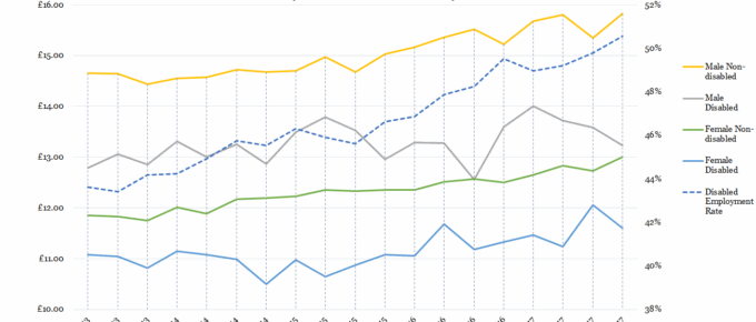
While non-disabled men’s and women’s wages have been incrementally rising since 2013, those of their disabled counterparts…
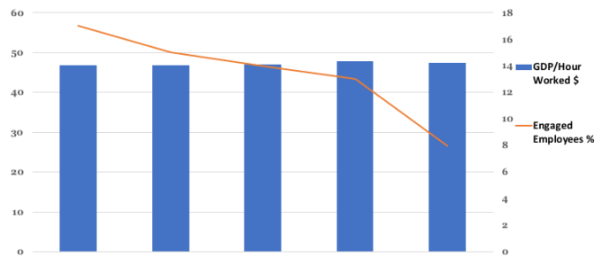
Chart of the Week: Week 4, 2018: GDP per Hour Worked v.s. Employee Engagement
The chart shows that just 8% of UK employees are enthused about their work and work environment in 2016. This represents a fall from 17% in 2012. The chart …
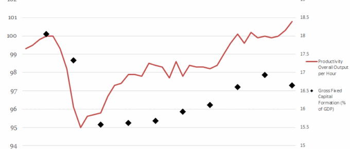
Chart of the Week: Week 26, 2017: Productivity Output v.s. Gross Fixed Capital Formation
This chart shows the relationship between the level of gross fixed capital formation (GFCF) and the productivity of the economy.
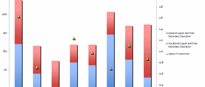
Chart of the Week: Week 44, 2016: Government Spending on Education v.s. Labour Productivity
The chart shows that the UK, when compared to other EU countries with strong economies, has one of the lowest levels of spending on vocational education as a percentage of GDP (under 1.5%).
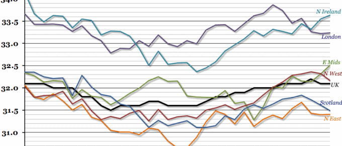
Chart of the Week: Week 7, 2016: Hours Worked by Region
According to today’s labour market report from the ONS, total hours worked in the UK reached a new peak in the final quarter of 2015.
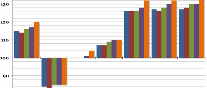
Chart of the Week: Week 38, 2015: International Comparison of Productivity
At the end of last week, the Office for National Statistics released their annual international comparison of productivity for 2014, and it showed that although the UK’s productivity increased very slightly, our relative position within the G7 worsened to the lowest point on record.