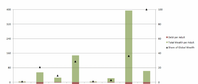
The chart demonstrates the vast disparities in wealth per adult across the world. North America and Europe hold 65% of the world’s wealth, whilst only accounting for 18% of the world’s adult population.
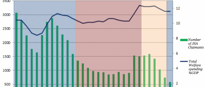
Chart of the Week: Week 51, 2016: Number of JSA Claimants v.s. Total Welfare Spending
The chart demonstrates the variation in welfare spending under each successive UK government.
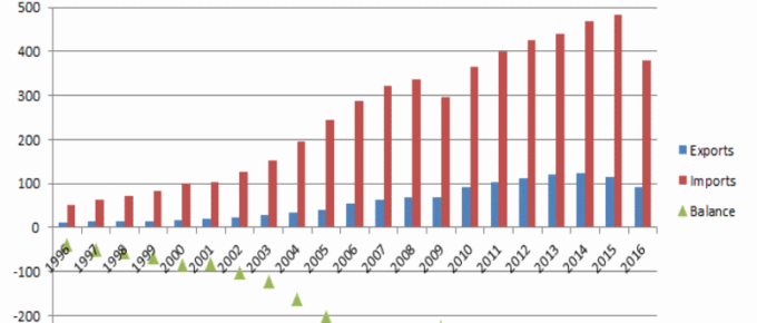
Chart of the Week: Week 50, 2016: US Trade in Goods with China
The chart demonstrates the extent to which the two countries’ economies are intertwined and the enormity of the US trade deficit with China, which has only increased in the last two decades.